

Ideation Digital specializes in strategic marketing services that drive results for your business or organization, let us show you how our SEO Services can help grow your business on auto-pilot.

Is your online presence strong but your sales numbers remain disappointingly low?
Do you feel invisible online and know it’s affecting your sales growth?
Wondering if your business website actually brings in any customers?
Invested in online marketing but not seeing any increase in sales or customer inquiries?
The problem is there is more competition than ever for attention online and having a "good enough" online presence isn't good enough to get you customers anymore.
At Ideation Digital marketing we focus on building websites and SEO marketing programs that get you customers and leads, because why else would you invest in your small business marketing?
We understand the business saving impact of knowing you are getting consistent online leads from your website and online marketing. We are small business owners too.
That's why we only create online marketing that is optimized to produce sales and results. A.I. powered organic and comprehensive marketing systems that leverage the power of A.I. to create an online presence that actually makes the phone ring.

Want to discover how much not having an A.I. powered organic marketing system is costing your business already?
Get our digital marketing cheat sheet, made from a decade of experience in the industry, and customized for your business with exact steps to get consistent leads from your online marketing and finally feel like your online marketing investment is worth it!
How It Works
1. Analyze and Create a Strategy
We audit your existing marketing and needs, and help you figure out where your best opportunities are and agree on a plan that fits your goals.
2. Fast Implementation
Based on your strategy, we create your website and other marketing assets within a week so that you get leads FAST, and we offer unlimited editing so that your online presence always looks its best.
3. You Get Leads
Our expert team implements effective online marketing strategies to bring in leads and improve your local visibility, putting you in front of the right people at the right time so they actually reach out.
4. We Make Sure You Keep Getting Leads
We continue to monitor and actively manage your website, SEO, and digital marketing campaigns, allowing you to focus on your business while it shines online.
Here's what you get working with us:
Trust
We only recommend products and services that align opportunities with your goals. We focus on results for your business first.
Freedom
We manage all campaigns and assets for you. Need an update? No problem, send us an email, a text, or we will even create you a slack channel.
Growth
We don't just build websites, create SEO plans, and run ads for online marketing campaigns, we create comprehensive a.i. powered organic and paid marketing programs that bring you leads and customers.
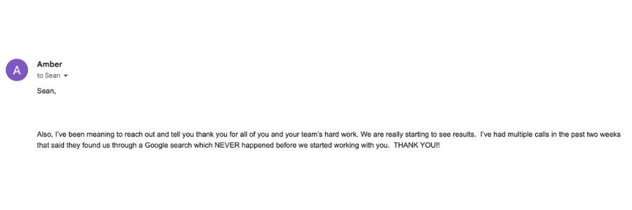
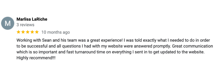
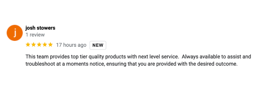
See What Small Business Owners are Saying About Working with Ideation Digital


Responsive Web Design: Tips for Mobile Optimization
In an era where smartphones rule the world, a well-optimized mobile website is no longer optional - it's a prerequisite. By 2024, with over five billion global mobile users, a responsive web design that functions flawlessly on any device is indispensable. Through this article, we delve into proven tips to effectively optimize your websites for mobile devices and elevate user engagement. Advancements in technology and shifts in consumer behavior render responsiveness essential, ensuring a seamless experience across all platforms. So buckle up, because we're about to amplify your web design techniques and help you unlock your website’s true mobile potential!

Responsive design is crucial in modern web design and development as it ensures that websites can adapt and provide an optimal user experience across different devices and screen sizes, such as desktops, tablets, and smartphones. By implementing responsive design techniques, websites can automatically adjust their layout, content, and functionality to cater to the specific needs and capabilities of various devices, ultimately enhancing usability and accessibility for all users.
Understanding Responsive Web Design
In today's world, where over 50% of internet users access websites using mobile devices, it's crucial that website owners pay attention to how their sites appear on different screen sizes.
This is where the concept of Responsive Web Design comes into play. In simple terms, responsive web design means creating a website that adapts seamlessly to any device, regardless of its screen size and resolution.
For instance, imagine accessing a website from your desktop computer - the site's interface should cater to the wider screen dimension.
Now, imagine accessing the same site from your mobile device - a responsive website would automatically adjust itself according to your device’s smaller screen size.
A responsive website can be reached via any device without compromising the user experience (UX). Thus, companies that invest in responsive web design are far more likely to retain their visitor engagement and loyalty
Role in Mobile Optimization
With mobile being the primary driver of internet usage, it's imperative for business and website owners alike to ensure that their online presence is optimized for mobile. Responsive web design plays a pivotal role in this regard.
| Advantages | Disadvantages |
|---|---|
| Improved User Experience | Initial Costs |
| Cost-Effective Maintenance | Gradual Loading Time |
| SEO Benefits | Increased Complexity |
The table above summarizes some advantages and disadvantages of adopting responsive web design.
To put this into perspective, think about building a house; you want it to be sturdy enough to withstand all atmospheric changes while simultaneously valuing practicality. Similarly, with responsive web designs, you want an interface that delivers ease-of-use regardless of device flexibility yet still maintaining its aesthetic value.
While responsive web design certainly contributes positively towards mobile optimization, it's essential to understand that there are other factors to consider. Hence, combining responsive web design with other optimization practices like compressing images, decluttering of ads, can result in a more mobile-friendly, engaging user experience.
01
According to a 2020 report by Datareportal, more than 50% of global website traffic comes from mobile devices, urging for the need for responsive web design that can cater to this audience.
02
A Google research established that site speed matters; even a one-second delay in loading can result in a 7% reduction in conversions. This fact accentuates the importance of using responsive design to ensure ease of use and quick loading times.
03
Based on a study by Econsultancy, about 62% businesses that incorporated responsive design into their website saw an increase in sales. This speaks volumes about the effectiveness of such design practices in enhancing user engagement and conversions.
Concept of Break Points
The concept of breakpoints is the foundation upon which responsive web design is built. In practical terms, breakpoints refer to the specific widths at which a website's layout changes to suit different device sizes and orientations. Each breakpoint determines how the content will react to different screen sizes, ensuring that all users have an optimal viewing experience regardless of device type or size.
For instance, content can be displayed in a multi-column format on a desktop or laptop, but with a single column for smaller screens, like tablets and mobile devices.
To ensure that your
website translates seamlessly across multiple devices, it's imperative to identify the most suitable breakpoints for each interface. This step forms part of the planning stage long before any coding takes place.
Implementing Responsive Design
Implementing a responsive web design can influence project timelines depending on its complexity. However, some best practices can ensure smooth implementation.
Firstly, begin by prioritizing essential content above all else. When designing for mobile devices specifically, remember that screen space is limited and hierarchy within your design should account for this. Also consider an overarching "less-is-more" approach when dealing with reducing clutter and enhancing clarity for your users.
It's akin to preparing for a camping trip; everything must be packed efficiently whilst ensuring core essentials are easily accessible.
Another essential aspect is leveraging fluid grids for responsive layouts. Fluid grids ensure appropriate spacing between elements which go hand-in-hand with breakpoints defined earlier - resulting in clean aesthetics without jarring elements shifting around as a user switches from landscape to portrait modes.
Take this example of a simple fluid grid:
.container{ display: flex; flex-wrap: wrap; } .box{ width: calc(25% - 20px); margin: 10px;}
This allows content within several boxes within the container div to adjust to the width of the device.
It's also crucial to keep typography responsive and intuitive, while using conditional loading to manage browser resources effectively.
Effective Use of Media Queries
Media queries are an essential component of responsive web design because they enable web developers to customize the presentation styles of their content based on factors such as screen size and orientation. They define specific styles based on specified conditions such as width or height parameters.
Different media queries can be created based on specific breakpoints defined in pixel or em dimensions that define the best view at specific screen sizes. To ensure all devices are considered, it's best to start with creating media queries for smaller screens before scaling upwards.
By avoiding fixed-pixel values and going for responsive units such as percentages, ems or viewport usage units, the code will become easier to read and edit in the future. When using images within your website, make sure they're optimized to respond well on smaller devices using either cropping out unimportant information or using different image resolutions depending on the device.
Picture this: You’ve designed an elaborate call-to-action button on your webpage, but it doesn’t fit properly onto the screen of someone’s iPhone -something that could be solved with media queries. Being meticulous with the media queries will ensure that users can access all crucial information regardless of the device they're using.
Advantages of Responsive Design
With the increase in mobile device usage, responsive design has become an essential aspect in developing websites that provide a seamless user experience across various devices. By adopting this approach, businesses can reap several benefits that include:
01
Cost-effectiveness - Since you're designing one website that works seamlessly across multiple devices, it can save a considerable amount of time and money compared to developing multiple versions for different platforms.
02
Improved Search Engine Optimization (SEO) - Google prefers responsive websites; that's why the search engine giant recommends their use. Using responsive design can help your website rank higher in search engine results pages (SERPs).
03
Easy Maintenance - When using responsive design, any changes made on the main website reflect across all devices instantly.
Enhancing User Experience
One of the critical benefits of responsive design is the enhancement of the user experience by providing quality content without compromising the site's functionality on smaller screens.
To achieve optimal user experience with responsive design, there are certain elements that need to be put into consideration when designing a site:
- Size and placement of buttons: On smaller screens, it can be challenging to click on small buttons or links due to finger size interference. It's essential to ensure space between clickable elements for easier navigation.
For example, when creating a call-to-action button, ensure they are large enough to be clicked with ease and spaced appropriately such that fingers do not press multiple buttons instead.
- Optimizing images: For a better experience with image-heavy pages, it's crucial to optimize images' sizes so they don't affect load times; using image compression techniques can also reduce data usage.
Smaller resolution screens require less image detail than larger ones to avoid slow loading times.
- Simple menus: On smaller screen devices being able to navigate smoothly through a site is crucial. It's best practice to design menus that are simple and easy to interact with.
Take the example of a Comicbook shop website. Command icons can be used, portraying the menu in drop-downs, or creating icons which is more engaging than a clutter of words creating an eye-catching visual page.
By acknowledging these elements while building out your responsive design layout, you ensure excellent user experience.
Common Pitfalls in Responsive Design Implementation
In the quest to remain competitive, responsive design has become an indispensable aspect of modern website development. However, even seasoned web developers can fall victim to common pitfalls that may affect the overall performance and usability of a website. Some such challenges encountered during implementation include:

Neglecting to consider mobile-first design: It's easy to overlook the prevalence of mobile users when focusing on desktop designs. Neglecting to adopt a mobile-first approach could lead to poor user experiences on smaller screens.
Ignoring cross-browser compatibility: Compatibility issues, particularly among different browser types or versions, could result in inconsistent performance and appearance.
Skipping quality assurance and user testing: Relying solely on automated tests fails to take into account how real-world users interact with the website. Manual testing by actual users enables developers to identify specific problem areas like broken layouts and functional issues.
Neglecting touchscreen interactions and typography: Unlike desktop devices where mouse clicks and hovers suffice, mobile devices require touch screen-friendly interactions and legible font sizing.
Disregarding vector graphics (SVG): Vector graphics are critical for ensuring high-quality visuals without compromising on load times.
Overcomplicating CSS frameworks: While CSS frameworks offer excellent benefits like reduced development time and standardization across devices, overcomplication often results in bloated code that slows down website loading speed and overall performance.
Failing to meet accessibility standards: Meeting accessibility requirements not only ensures legal compliance but also enhances user experience for persons with disabilities.
An example of this could be visiting a website that takes ages to load or where images appear distorted on some devices. Consequently, it leads users frustrated with the experience/site making them spend less time which results in higher bounce rates.
To avoid these common pitfalls, web developers should always prioritize planning, research, and continuous user testing throughout all stages of the development process. It is important to ensure that the result will ultimately benefit the user rather than just our aesthetics alone as developers. With responsive design, it’s up to the user to choose what experience best suits them.